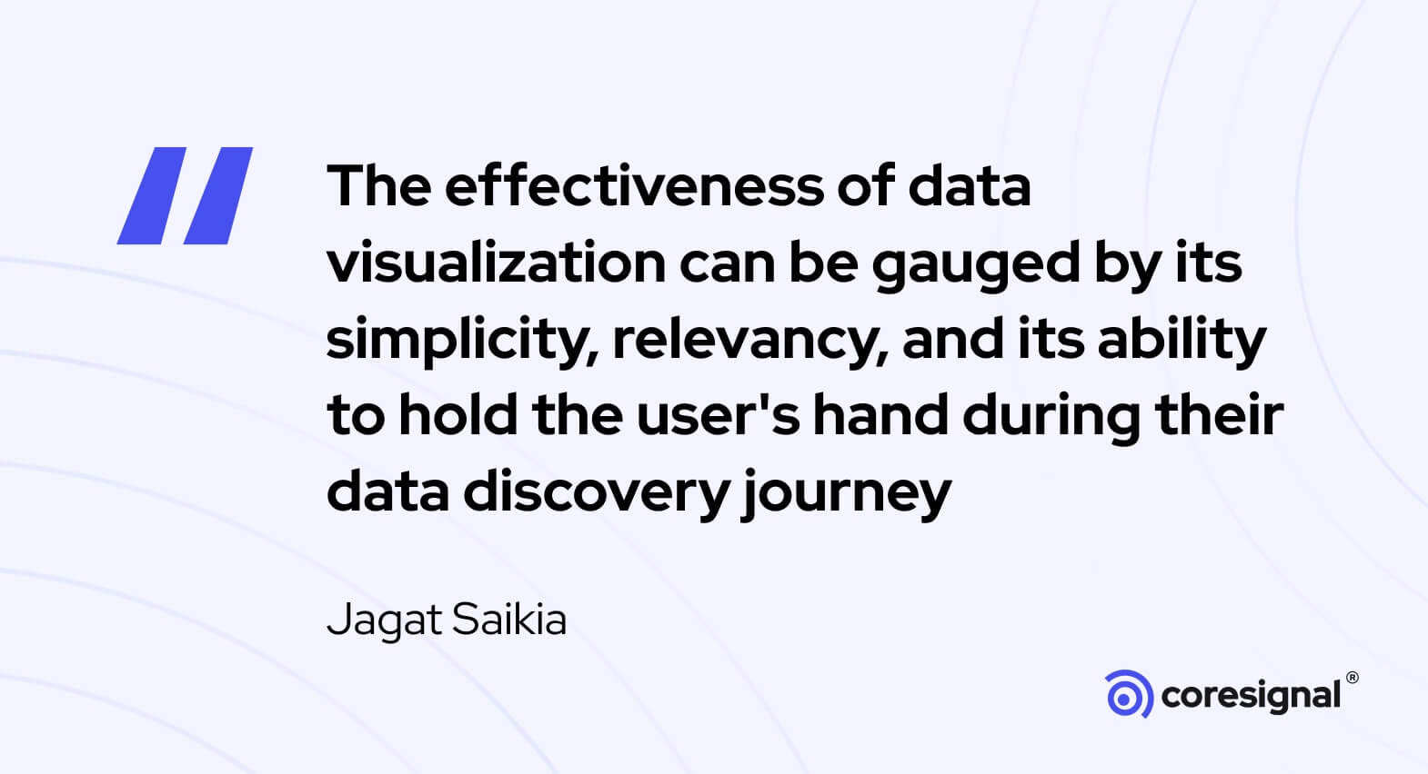
Thank you to CoreSignal for featuring my quote on data visualization. I believe that the article on 20 Data Visualization Quotes really hits the point on the importance and philosophy behind a good data visualization.

In an extremely fast paced world, with short attention span and less time for making critical business decisions an effective Data visualization can help to convey the story and make it come alive!
The exponential growth of data has increased the demand for candidates that possess a Masters in Data Science or other advanced degrees because companies are looking for skilled data engineers who can uncover insights from large sets of data.
I remember one of my earlier reference book on Data Visualization was by Stephen Few who authored Show Me the Numbers: Designing Tables and Graphs to Enlighten. It addressed topics such as – why some dashboards are poorly designed, how to create proper tables and graphs for effective and efficient communication. I would still recommend this book for anyone keen to start with the basics of Data Viz.
This graphical representation of data is at its core is a mapping of an input (DATA) into an Output (graphical element), which is able to convey the right trends, magnitude, insights. Of course, there has to be a synergy between the statistical elements as one should know How various data types can be represented.
EXAMPLE of Data Visualization:
Let us take Time Series data as an example where we are say, trying to convey the Weekly Sales trend of a popular brand. With simplicity being the ultimate sophistication, I would prefer to create a LINE GRAPH to represent any Time Series data. The easy versatility and readability it provides to the viewer to understand trends over time is unquestionable.

However, with the advent of powerful Visualization tools like PowerBI, Tableau etc. there are unbelievable number of creative ways that can help to depict a Time Series data. Some of those are-
• Line Graph
• Area Chart
• Bar Charts
• Gantt Chart
• Heat Map etc.
While the debate continues whether Data Visualization is an art or a science if you follow Tableau Public you can see such amazing viz submission by data enthusiasts which are really creative and ingenious!
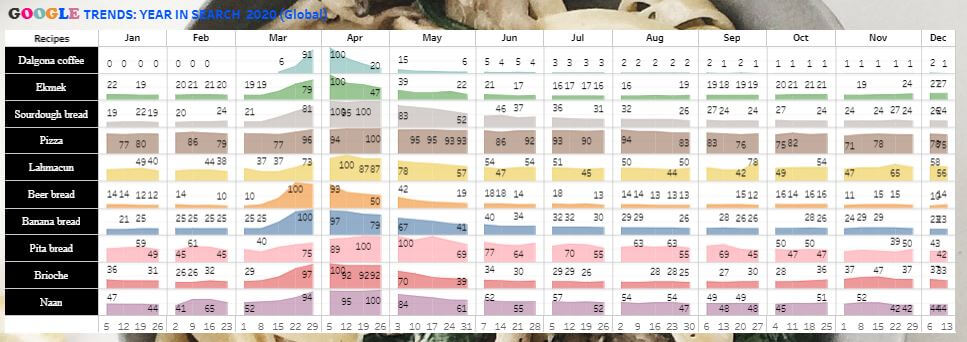
Here is one of mine where I have visualized Google Trends keywords (Food and Beverages) for the Year 2020!
Sharing the link to the hi-res Visualization in Tableau Public. (Link).

Data visualization is definitely a branch of Descriptive Statistics now, where we use elements of design skills, data skills, statistical and computing skills to translate data into a visually compelling story.


